How the Gutenberg Diagram Can Help Your Homepage Make Sense
Form follows function in web design. Your page has a purpose, and you’ll get the best performance possible out of it by designing it in a functional way.
That is what web design and conversion rate optimization are all about. Make it as easy as possible for your visitor to get from Point A to Points B, C and D — and you’ll have a high performing page on your hands.
Where to start?
The Gutenberg Diagram can be an excellent starting point for certain pages. It’s great for pages with low to medium amounts of content and a great deal of targeted or direct traffic (i.e. people already interested in your page). That makes it a potential choice for a homepage or landing page.
Wait … What the heck is the Gutenberg Diagram?
The Gutenberg Diagram is a visualization of how Latin-alphabet readers — those of us who read from left-to-right, top-to-bottom — process information presented on a webpage.
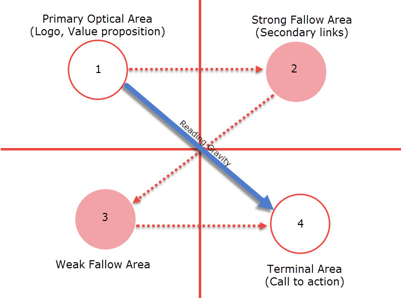
We start at the top left and move rightward. We then zig down and to the left and move over one more time (from 1 to 2, 3 and 4 in the diagram below). That results in an uneven distribution of attention on certain regions of the page.
A Gutenberg page is divided into quadrants. We spend the most time on the top-left (called the primary optical area) and bottom-right (terminal area) of the page. It makes these areas ripe for your more important page elements. You can put the logo, headline and value proposition into Quadrant 1, the primary optical area, and work towards concluding with a strong call to action in Quadrant 4, the terminal area.
Seem a bit confusing? Let’s explain a little more to show how Gutenberg can help develop a clean page hierarchy.
Use Gutenberg to lay out your page hierarchy
There has to be a logical progression with how you present information on a page. Once someone lands on your page, your page should answer a few questions very quickly.
- “Who are you?”
- “Why are you important?”
- “How can I interact with you?”
Gutenberg arrangements allow you to present that information quickly and simply, without the message getting muddled in extraneous page elements. Let’s take a look at a few examples:
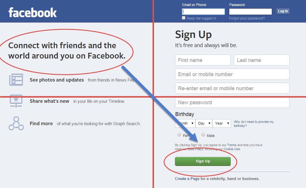
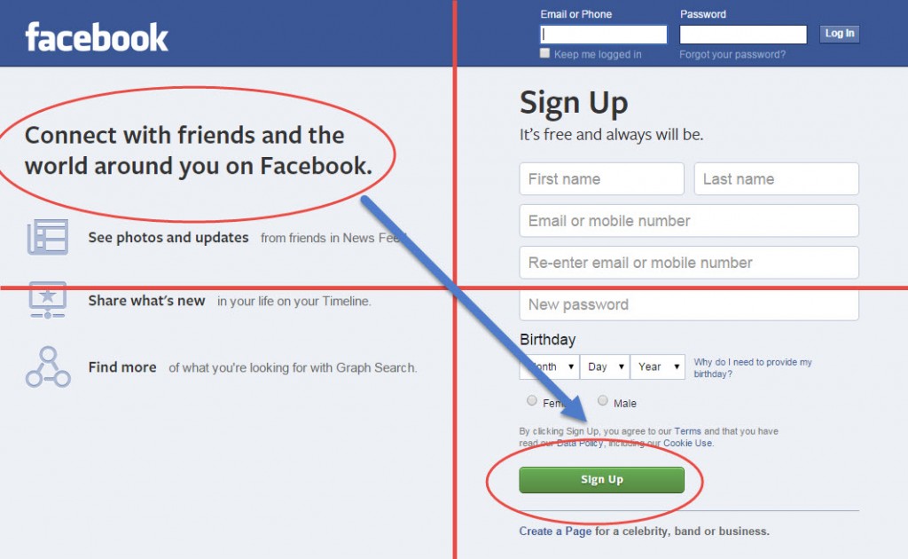
Facebook’s homepage uses a Gutenberg design. The primary optical area answers “Who are you?” (Facebook)
and “Why are you important” (social networking site). The terminal area shows how to interact.
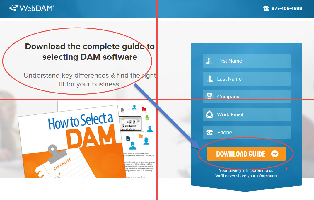 Again, the logo and value propositions are placed in the first quadrant. A phone number (Seconary
means of conversion) is in the strong fallow area. We conclude with a call to action in the terminal area.
The content isn’t as tightly packed as an F- or Z-pattern page, so you use this to your advantage to create dramatic spaces around page elements. With “whitespace” surrounding your value proposition or call to action, it now makes it harder to ignore.
When Gutenberg is a bad idea
Again, form follows function. If you have a page that has too much content or visitors might be more likely to scan your page than directly consider the information in it, a Gutenberg pattern will fall flat.
In these cases, an F- or Z-pattern might be more beneficial, because they account for large amounts of content and/or visitors who might lose interest before reaching the bottom-right of the page.
If you’re not sure whether or not a Gutenberg designed page might be a good idea, there’s only one way to find out. Time to run some tests!
