A/B testing can pinpoint the parts of your site that are costing your sales. Find out how a simple design change increased a site's conversion rate by 6x.
The Details
Marketers these days are keen to point out that "the fold" — the part of a web page that's visible once you open it — is an outdated concept. Once upon a time, we thought that anything that's anything should go above the fold.
But thanks to smartphones, people browsing the web have been trained to scroll and search for what matters to them. So, the thought is, you don't have to stick something front and center for it to get noticed. If you put a form on the page, people will know to find it.
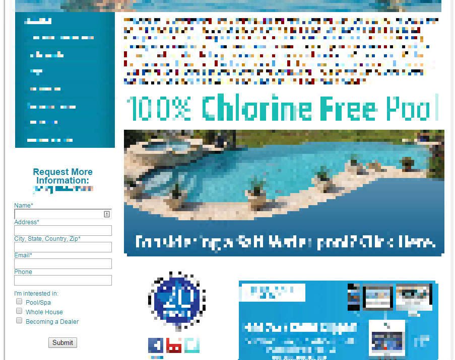
We put that to the test on a homepage (click for big), which had placed its lead collection form midway down the page, nested underneath its left navigation bar.
The Strategy
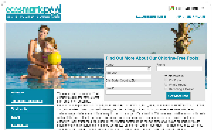
The hypothesis here was simple: If we just move the form up — above the fold — it should be more noticeable.
It's not that we think the fold still matters. It's that it's a more sensible place for the form in the page's visual hierarchy. As visitors scroll down a page, they expect to see some questions get answered rather quickly ("Who are you?" "Why are you important" "How can I interact with you?").
The page already has some good branding in its top navigation and superb on-page content, so by moving the form up, we're answering that third question before the visitor has time to click the back button.
The Results
Conversions rose almost six-fold.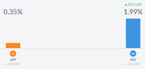
The Conclusion
It's not necessary to build a page around the fold, but it is vital to keep a logical visual hierarchy in the way you design your pages. That can include things like the Z or F pattern or the Gutenberg Diagram, but at its most basic level, you need to answer those three important questions quickly and efficiently.
If you can quickly and efficiently inform your visitors who you are, why you're important and the action they're expected to take upon reaching your site, you'll cut bounces, boost your on-page time and ultimately raise your conversion rate.
Get Started With Your Simple, 3-Step Conversion Optimization Strategy