From A/B to C: Progress Your Onpage Testing To Maximize Results.
The Details
Successful A/B testing is all about approaching your testing ideas strategically. While novice A/B testers might choose to test unrelated page elements one-by-one, you can drive more results by progressing your page from one test to the next.
The Strategy
The page explained the benefits of the company and prompted property owners to submit their information in an on-page form.
The page had two outstanding issues:
Users were not engaged with the material, as indicated by heatmap and bounce rate data, and Consequently, these users were not converting.
Lacking visitor engagement, it’s not possible to increase conversions with a single test. So, we approached these issues by staggering two separate A/B tests.
First, we chose to address the lack of overall engagement. Then, once we saw a higher percentage of users sticking around to engage with the content, the next step in our testing progression focused on the language of the primary call-to-action to drive more conversions.
In our first test, the control condition was primarily white copy on a blue background with an orange call-to-action button above the fold. Our variation tested the addition of contrasting elements to the page, in order to make information more visible for readers.

Next, we turned our attention to the primary call-to-action. The control copy read “See if your home qualifies.” Our hypothesis was that this copy was weak, implying that there was a chance a user may not qualify, which would make their effort seem wasted.
In order to add contrast, part of the headline and the benefits copy were changed to an orange color that matched the call-to-action button. In our subsequent efforts, we replaced the uncertainty of the previous message with a benefit-driven question: “How much could your
property make this year?” We continued that sentiment in the button text, which read “Find out with your free consultation”.

The Results
Our test of contrast produced a statistically significant 282% increase in conversions. The change in messaging on the form produced an additional 99% increase in conversions which was also statistically significant.
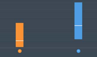
Outperforms Control
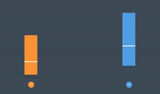
Outperforms Control
Maximize the Results of Your Website with CRO